Play to your Customer’s Process – MOHELA.com 1 Hour Website Redesign
August 13, 2010
The second installment of the 1 hour redesign series. If you’d like your website evaluated with a complete sample design, please let us know.
I encountered this week’s redesign while trying to pay for my education. Recently, my loans were transferred back to MOHELA (who originally owned them), and I was faced with registering on their site to set up my bank account. It proved difficult and requires a FAX! I’m still not totally set up, and now have bills 3 days overdue. The rest of the website reminded me of waiting in long lines in school, then missing a form to stand in another line.
Don’t take this the wrong way, MOHELA is a fantastic organization and their goals are second to none, not to mention providing the cheapest money I’ll ever borrow. Hope they’re able to correct some of these issues on the website. [update: after talking on the phone, they are in the process of developing a new payment processing application ]
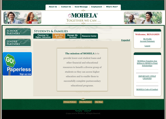
Mohela Original Site
 Strengths:
- Clearly identify where I am on homepage
- Mission prominent on homepage
- Easy access to login
- Relevant Photos
- Usability nightmare – same location, same color navigation elements that change throughout the site with different drop downs and labels. Some labels confusing. Not sure where I’m at. Home button awkwardly placed (and logo doesn’t link to homepage)
- Four-level submenus in students and families section
- Processes not clearly defined – trying to ‘go paperless’ as the homepage billboard suggests, and can’t find where to input my confirmation codes, hence the issue for this redesign.
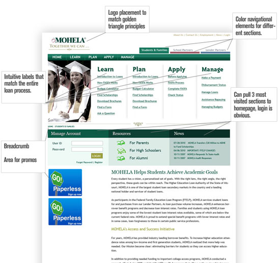
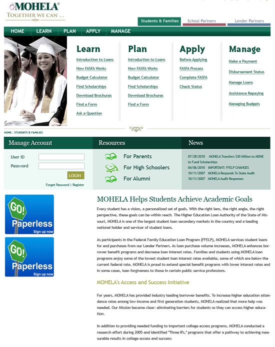
The mohela.com redesign
This second installment proved to be more difficult, not having a full understanding of all the components of this organization, or having access to any site stats (top visitors, most requested pages, etc) to know what the people on the site are doing.
The Redesign Explained
Usability
- One of the biggest challenges was creating a clear navigational structure. MOHELA does need to facilitate a lot of different visitors and interests, not to mention the political challenges I’m sure they face.
- Introducing color as a navigational element. Used green, red and blue as a visual marker to distinguish between the very different needs of the main users: Students/Families, School Partners, Lender Partners. The main nav bar, and content boxes would change color to match that section.
- Simplifying the Students & Families navigation. Currently, pages are inappropriately labeled and categorized in the tabbed navigation. Re-organizing these to match the steps in the process is a must. It makes it easier for students to get a clear picture of the whole loan/repayment process and an intuitive way to navigate.
- Could go one step further with a great headline above the four sections; “Paying for College has never been easier”.
- Using lists enforces these ‘steps’ by showing the types of information associated with each step. This also allows users see all the options before selecting and save the time/hassle of rolling over each tab to see the options.
- Not centered the logo and top navigation. This is more personal preference; the centered logo can work, however having the first navigation you see being more utility in nature, makes the site appear to lack content. This also more closely follows the eye tracking golden triangle principle.
Although this design doesn’t have the creative ‘pop’, the improved usability would save on admin costs, and provide a better experience for their lendees.
We’re always looking for companies to help, get your website evaluated and redesigned.


