Start Converting All Those Website Visitors Into Leads
Getting visitors to your website is only half the battle. In this webinar, you’ll learn actionable steps to incorporate into your existing website that are proven to convert visitors into leads.
Originally Aired: October 27, 2021
In this webinar you’re going to learn:
- Understand how vital conversion rate optimization is
- Tips to match your website to YOUR sales cycle
- How to get more leads from your existing traffic
- Plus, the three questions every visitor needs answered
Webinar Transcription
Good morning and welcome to our Webinar. Get more Leads Now we’ll cover some easy conversion improvements for your website. I’m Ben and we see and I’ll be leading us through this topic.
I’ve been with WSI. B2B marketing for nearly 15 years and have a background in graphic design and a passion for helping clients sell their products and services online. Tiffany from our team is on standby to manage any questions and help with tech stuff. We’ll cover those at the end with that, let’s dive in.
I want to start with a quote from Brian Eisenberg, who is the forefather of conversion rate optimisation where he talks about it’s easier to double your conversion rate than double your traffic. And we know Google ads are continuing to get more expensive. We know SEO is a long and time consuming play to get that traffic, it is far easier. I promise to go attack your conversion rate than to go find that additional track.
So why is it important? Good experiences are now expected in the last two years that digital transformation has skyrocketed in terms of the experiences that we expect as consumers. And now we take that as we’re at work buying things in a business to business setting as well. The Amazon, the Apple, the Zappos of the world has set that bar for business to business experiences as well. And great businesses like yours deserve it.
You value and you are passionate about what you do for your customers or the product that you create, and you deserve to grow that business as well. And that can be done attacking conversion. And lastly, revenue. There’s always money at the end of the tunnel, usually right in 15 years. We’ve yet to come across a client where more leads and more conversions didn’t equal more customers, more clients and more revenue.
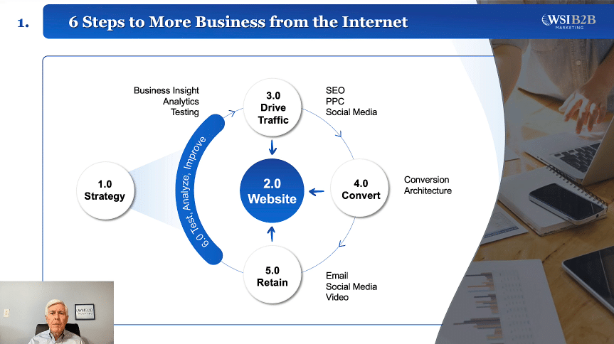
At the end of the day, before we get into the details of some of the tips I want to go through today, it’s important to realize that conversion architecture is one step in a much larger digital marketing strategy, and that strategy should stem from your overall business strategy. What markets, what products, what direction your company is going in should help develop a digital marketing strategy that starts with your Web properties, whether it be your main URL and your main website, or it could be an ecommerce store or even your LinkedIn company profile page.
You need to have some web property to send those visitors. And next you need to have those visitors. That’s vital.
You have to drive traffic in some capacity, whether it’s SEO, pay per click other offline ads. Social media. You need those people because that’s where they get converted. They convert on your website, they convert on your social media places. And that’s what we’ll talk about a bit more today, but you need to get their information or turn them into a customer.
From there, you need to retain them via email, social media, video, keep them engaged, keep them engaging with your product and buying them. Wrap around all that is the ability to test, analyze, and improve those systems. So what is the conversion rate? Very simply, it’s the number of goal completions divided by your total visits times 100 to get a percentage for us, we consider that conversion anytime a user gives up their information via name, an email address, phone number or company name, maybe even connecting to your company page on LinkedIn.
They’re giving up some piece of information on websites.
It’s a lot of times demos, downloads and white papers or articles. Sometimes we’ll gate tools and widgets and require information for accessing them. If you have an ecommerce site, it could be a wholesale, or in some cases it could be an additive car, or it could be as easy as newsletter. Sign up with this. It’s important to note that goal completion could mean lots of things.
One of the other pieces that we do like to track is what we call sales activity. It’s showing buying intent, but not quite giving up information. These gold completions could be a pricing page view, for instance, or watching a video on how to buy or install your software, or maybe a download of a very specific product brochure. They’re looking. They’re just not ready to give up their information.
So why is this hard? For most of our clients, it’s a low traffic or a niche business comes into play. You’re a smaller business. You just simply don’t have the 20,000 visitors a month that it takes to get good statistical data to make decisions on conversion rate improvements so that low traffic niche business can be a challenge. We also see misaligned messages and very poor call to action.
We still come across sites that simply have that contact us in the upper menu and that’s good enough for them.
Team time and lack of priority is another key culprit. If you have a smaller marketing Department with two or three folks, they’re already probably pulled in a million different directions, and conversion rate optimization isn’t anywhere on their radar. And lastly, that testing ability to know what tools or how to go about it, and even simply the knowledge of conversion rate improvement. As we mentioned in the beginning, it’s easier to double your conversion rate than your traffic. A lot of CEOs and C level folks don’t realize the power of attacking their conversion rates on their website.
So on to the actual help. This quick screenshot is from a digital marketing blueprint that we put together that I like to offer up with this webinar. We’re going to be doing a free conversion audit of your website, so my contact details will be at the end. But drop me a line and we’ll do a half hour audit of your website and attempt to improve enough with the promos. Let’s get on to some actual tips.
The first one is to simplify and simplify and simplify. Again, this is a challenge because so many departments are involved and designed by committee, quite often in Web pages, particularly home pages. Hr needs a career’s link. The CEO wants to include his father’s favorite tagline. You have sales, you have marketing, you have the product Dev team wanting to support options.
It can get complicated very quickly. In this example. This is a couple of years old example, but we still come across sites that look like the one on the left where there’s no visual hierarchy, no clear value proposition. Even the headlines are hard to pick out of there. There’s probably 500 words on that page here.
I doubt someone’s even going to spend the time to read that stuff to really get in the note. And that’s why you need to simplify. In this example. They work with manufacturing technologies, but they had three main pieces of their business. They were components and did assembly and put systems together.
So we put that first and foremost.
So you need to simplify make it as easy as possible for the consumer to a understand your business, know what you do and make it as easy as possible for them to buy.
Next, you need to answer the four age old questions. Where am I? What can I do here? Why should I do it? And who else have you done before?
The first one is fairly easy and fairly standardized these days. We have our logos in the upper left hand corner, but I came from a search result page. I came from a LinkedIn folks. I came from some other blog. It’s really just to confirm that I’m in the right spot that I thought I was going to be next.
You need to answer, what can I do here in this example of Air table, it’s fairly easy. The only blue colored buttons on the page are for them to sign up into their try. And that’s what they want you to do. The why their headlines and sub headlines do a pretty good job of convincing you, but I know this page. The rest of it is packed full of benefits and features on why to sign up for their free trial.
And it’s kind of a bonus question. But who else have you done it for? It can also be incredibly valuable. Airtable, in this case, is a big enough brand where they have over 200,000 clients and they can pull some big brands. This really just improves your credibility and says that you can solve problems for these other big companies.
I can probably do it for you for the note that this can also be done via case studies or case reports that show that you can solve similar problems that your potential client may have. So where am I? What can I do here? Why should I do it? And who else have you done it for next, you need to know the customer and put their needs first.
And doing this for over 15 years. This is, without a doubt, one of the most challenging problems for clients. It’s easy to say how great we are, how good our equipment is. Look at this great project. We did it’s a little bit more difficult to have them turn around and put those into words and phrases that express the value they deliver for those customers.
And that’s the important piece we live in a me me world. What are you going to do for me? Is it going to give me a promotion? Is it going to make a hero in the next board meeting? And these two recent examples were shopping a new project management platform, this one’s for client work.
Now, I don’t know if they’re advanced enough to have some personalization in there to know that I’m part of an agency, but that is exactly what I need it for. So they understand where I’m coming from. The other from Trust Pilot I was doing on behalf of a client. But if you’re a small business that’s doing ecommerce traffic, sales and customer loyalty are probably the things that keep you up at night. They also have a pretty poor understanding of their main customers.
As an added conversion bonus trick, you can see how simplified they have these pages. But on Trust Pilot, they have an image of a woman who is looking at what they want you to do, which is another advanced technique of using some visual cues to drive the eye. Right? We like faces. They’re looking at something.
What are they looking at? And again, they’re looking towards that call to action.
Next, you need to be explicit this example from Neil Patel, who is a marketing guru and famous business person in the marketing world. This is from just one of his blog pages, and there are no less than ten calls to action on this. It’s a much longer page, but at least ten calls to action on this page. In this case, he has them split into kind of two different buckets. One is, do you want more traffic?
And you can see that in the header and the Sidebar. And the other is he’s actually offering up his marketing team to help you? Again, this is fairly aggressive, but I’m 100% confident that Neil Patel is testing this to be the winning version of driving more conversions across his website. So now that we know exactly, we need to tell them, what do you need to ask for? And this is having the right calls to action at the right time.
In this sample from HubSpot, they have a simplified buyer’s journey. But during that awareness stage, you just realize you have a problem. So you’re looking in researching solutions to that problem. How do I fix this? How do I fix this piece of equipment?
How do I fix this? Internal issue. So that includes making sure you have educational type content. This is White Papers ebooks, research reports, analyst stuff, whatever can help them become a more educated buyer. Then in the consideration stage, they’re starting to look through other options.
How else can I solve this? They’re probably shopping different companies. This is where you need to really showcase your own personality and the solution you provide, so you become a little bit more interactive. These are live interactions. These are Webcasts podcasts comparison, white Papers, things like that to help edge them through the journey.
And lastly, the decision stage. This is where they need to get their hands dirty and either see your product in action or get the product comparisons. Show me exactly how you helped the company with my same problem. My same size. These types of solutions you want to offer also worth noting in this decision stage.
More than likely, they are probably selling to their own internal stakeholders, and it’s important to have information and data that can help strengthen themselves internally. So hopefully we’ve simplified our page. We know our customer, we’re being explicit and we are asking the right things at the right time. Now it’s time to actually Polish that page, and that includes clear and direct headlines that explicitly describe your value proposition. And again, that customer centricity.
We live in the US world. You need to show them exactly how you’re going to make their life better. And an easy way to do that is to focus on benefits rather than features of your product or your service. Next, you need to have all the information there that they can make that decision. Now, this decision comes with a caveat.
We are typically not selling the entire software, the entire product, but we want to sell that call to action so that can be data sheets and case reports can be testimonials. It can be other pieces that help them make that decision. Just recently, we redesigned a Watch Demo page and the original was selling the entire software. Now this is a $25,000 piece of software that clearly takes multiple buyers and a three month buying cycle. Instead, we toned it down and had all the testimonials and all the supporting information.
Get them to watch the demo. We just wanted them to see how great the software was and that instantly rose conversion rates. In that example, you also need to be trusted. This can include logos, credibility, logos of current clients if they’re recognizable like Airtable did. But in most cases, your company may not have Netflix as a client, but you can still have regional or local companies that are recognizable.
It’s also good to include third party endorsements from any other type of industry, periodicals or other industry blogs, or maybe even influencers in your industry that you talk to them with or your social validation. Do you have 3000 followers on Twitter? Then put that in there that can help ease someone’s anxiety to know that you are a real person and other people like you and an easy, no brainer one that we still encounter time and time again is have your contact details obviously present. If I’m shopping and there’s a phone number there, I at least know that someone there is going to be trying to help me and you have information about your company as an about page.
These things help make you look real and transparent.
It also needs to be graphically well designed. Do all the visuals and photos and images you have support your value proposition. Are they stock that everyone glazes over or are they real people with real products or with your real products? Are your actions contrasting in size and color and shape and space and things like that to make it obvious and it needs to be professional looking and have a modern design. The key of this one is to remove any red flags.
So if you have a broken image that creates a red flag, is your SSL lock broken and you look unsecure that’s a red flag is part of the content, not formatted correctly, or is it very poor photography? These are all red flags that can cause someone to bail and get out of your site and not convert. And lastly, again, you need to have a clear and compelling call to action. I mentioned earlier that people still have just that contact us in the upper right hand corner, and that’s not enough.
It’s not enough.
You need to have free trials. You need to offer up pieces of content for your consumers to download and build that relationship with you. It’s important to make sure that whatever you’re offering provides a solution to the problem that they came looking to solve that day. The other important piece to remember in whatever these calls to action and downloads are that you have is that there’s some level of value in that piece of information, and that value needs to be enough for me to say, okay, I will give you my email address or my phone number for that information because we all know I’m going to go into some drip campaign.
I’m going to be put on your newsletter list.
I’m going to get passed off to sales and someone’s going to call me so that trade of information is important to make sure that you have the value there.
And as you get all those things done to really Polish the page, there’s a fantastic plugin out in Chrome called The Conversion Checklist, which takes those kind of key concepts I just covered and breaks them across five or six big buckets of strategy copy, technical visual, and is about a 60 or 75 item list that you can then go through on a page by page basis. Why I like it is because you can edit those, so some of them are very similar and you can duplicate them or we have our own, which is make sure the phone number is visible on your screen.
We can add that in a very cool plugin that is very easy to use. It can load on every page, which is also important since every page needs to have this value proposition with an appropriate call to action or at least guiding them through to additional information of yours to lead them to your product or service.
But you don’t have to take my word for it. There are dozens and dozens of split testing tools out there that range from very expensive to just $30 or $40 a month. We like to use Unmount for landing pages because it has conversion tools built in and you don’t need to be a developer or have any coding knowledge to use it. It’s a really sharp tool that has all the stuff built into it. There’s.
Bwo I know Google has one. There are plenty of tools out there that can help you get split testing or even multivariate testing. You can also use tools like Crazy Egg and Mouse Flow for Heat maps and Clickmaps. Just recently we ran a potential client through and identified a shimmer of light in a background image that was drawing all of the eyes attention away from their headline, away from their buttons and everything else. So there is an odd piece of Orange in the background of the image.
We were able to see that and swap it out for another image to get more emphasis on what we want them to do.
And all these things are in an effort to remove personal input. We just recently did a home page redesign that took nearly six weeks to get together because we were designing by committee. We had to get CEOs input, we had a videographer input, we had a marketing manager, and we are all really just saying our personal preferences of what we thought about site design as opposed to using data to make those decisions so vitally removed that personal input. And I know we attested to some not the best looking pages in the past, but they were working as a quick recap.
We now know conversion is important, so if nothing else, take it to your C level, take it to your boss that you can do more to improve your lead generation working conversion rate than a lot of other digital marketing tab.
We need to simplify and take that challenge on with your team to try to simplify your website again, to make it as easy as possible for that consumer to get through your buying cycle, answer the four fundamental questions on every page. Where am I? What can I do? Why should I do it? And who have you done it for?
Previously be customer centric. I can’t express the challenge and the importance of that. Be explicit in what you’re wanting them to do with the right offers at the right time in their buying journey. Make sure you’re providing value and solutions to their problems and not just talking about how great your equipment is or how great your facility you need to build that trust. And again, just like a used car salesman, you need to be continually asking for that trial closed and asked for the sale before wrapping up.
I do want to share an oldie but a goodie this is from marketing experiment, who is another long time successful company in conversion rate optimization. And they had always taken a very scientific approach to conversion rate optimization so much they had developed this formula. Now the formula, to me, isn’t as important as to understand and know at least know what the pieces of the formula are. So this is their probability of conversion formula. And what they did is they look at the motivation of the user.
So when are they needing this? Did something just break? I need to replace it today. Or is this a dream purchase that I’m just thinking about that clarity of the value proposition again, what are you doing for them? What benefits?
Why do I need to buy this from you right now? Which is that incentive to take action again, that can be whether it’s something broken and I need to replace it. Or you can help that incentive by offering a discount. Is there free shipping on larger orders? Is this discount only going through the end of tomorrow?
Right. We see it all the time. We see timers on websites of when this deal expires, they’ll push them forward. And lastly, you have friction and anxiety. Through this conversion process.
Friction can be any of those red flags that we talked about earlier. That kind of help me put the brakes on just a little bit and say, okay, why is this this way? Or I could be on an e commerce site and want to know how easy it is to return an item. But I can’t find a return policy again that creates friction in the conversion volume. And lastly, there’s a component of anxiety.
This is about entering information and really going through with the purchase. We’ve done a lot better in the last, certainly two years of fixing this. But still, I still think twice about getting out my credit card and putting it into a stranger’s web page. So what can we do to help resolve that anxiety with that? Thanks for joining us today.
I hope you guys got a couple of good tips that you can take to your team and help improve your conversion rate improvement conversion rates on your website. Again, as mentioned, send me an email here’s my information, and we’ll do a free conversion audit of your website and send that back to you. Thanks for joining us. We’ll see you next time.
Download the Guide from the Webinar
Download this free guide to learn how to convert more of your website visitors into leads.
Call Us to Discuss Your Growth
Contact us today and we’ll get started researching your digital presence and work with you to grow your business.